Use the timeline heatmap
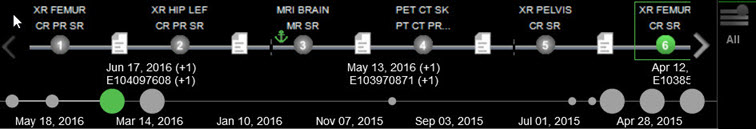
The timeline heatmap is displayed below the patient timeline and shows the entries on a proportional time scale to provide a better overview of the patient's history.
The heatmap provides the following information:
-
Each circle on the heatmap represents a set of studies, where the size of the circle is proportional to the number of studies in the time slot - 1, 2, 3, and 4 or more studies.
-
The currently selected set is displayed as a green circle.
-
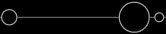
Sets containing only filtered out studies are displayed as hollow circles:
 .
. -
In contrast to the patient timeline, the timeline heatmap is always displayed entirely and adjusts to fit the available space.
The currently displayed part of the patient timeline is represented by a slightly thicker line on the heatmap.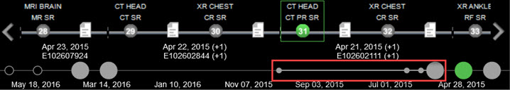
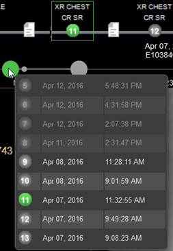
To view the set of studies represented by a circle:
-
Hover over the circle. The list of studies appears as a tooltip, with filtered out studies grayed out.
-
To open a study, select it in the tooltip list.
Display the timeline heatmap
To display the timeline heatmap for all instances of the system:
-
Select Settings.
-
Under System, select Timeline.
-
In the System - Timeline pane, select Show heatmap.
-
Click Save.
Note
This setting is available to administrators only.
Users who do not have administrator privileges can display the timeline heat map for their own account:
-
Select Settings.
-
Under Preferences, select Viewer Preferences.
-
In the Preferences - Viewer Preferences pane, below Patient History, select Show heatmap.
-
Click Save.